

The Power of Colour in Branding: Built to Blend, Made to Stand Out.
When did everything start looking the same? Soft neutrals, muted tones and minimalist branding have dominated over the last few years. Of course, there’s nothing wrong with simplicity. But when everything starts becoming increasingly beige, it’s no surprise people crave a little colour and personality.
Somewhere along the way, standing out stopped being the goal and blending in became the safer option.
Sea of Sameness
Minimalism feels clean, calm and timeless, so it's easy to see why it dominates. But when lots of brands follow the same formula, things can start to feel a little... familiar.
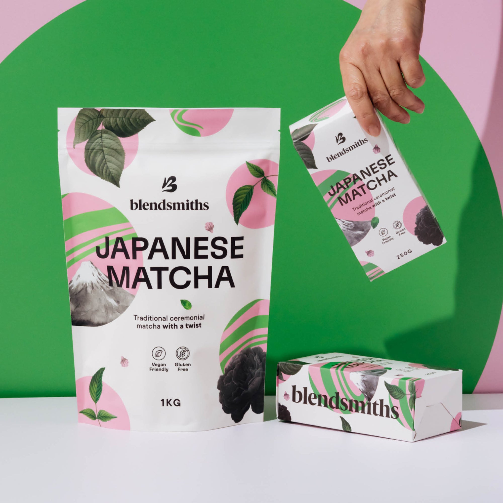
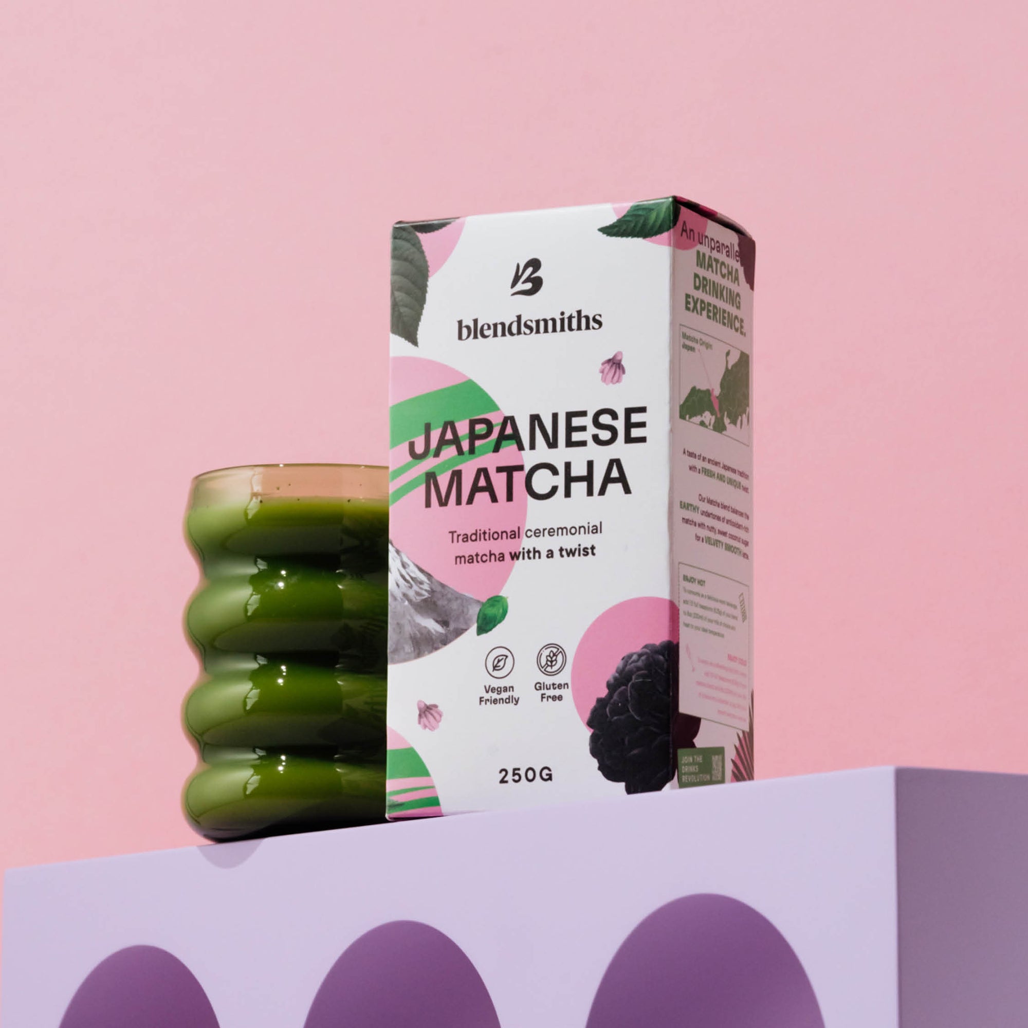
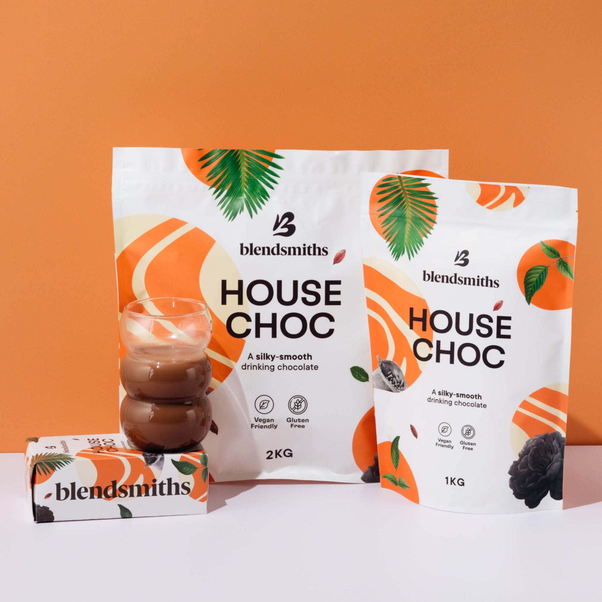
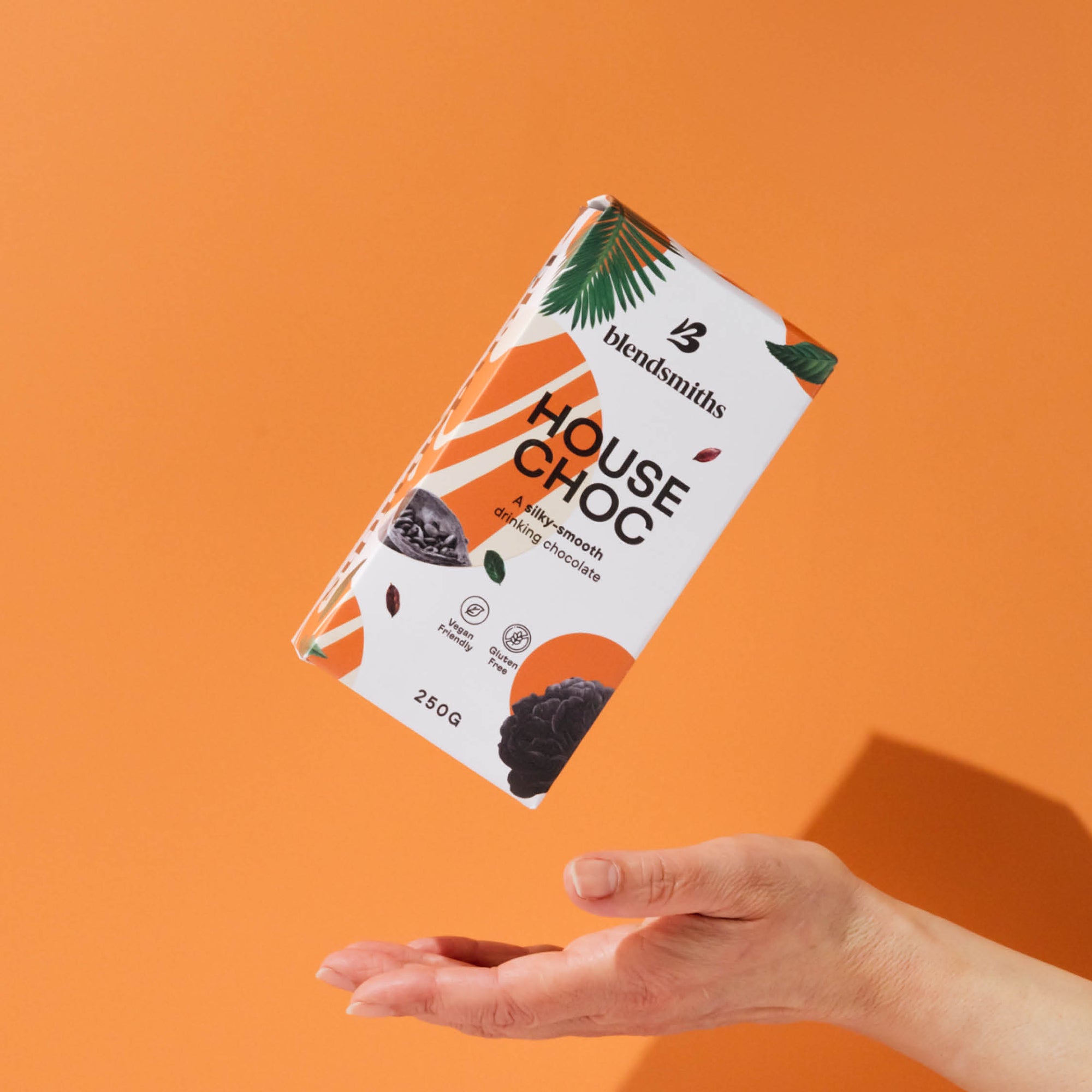
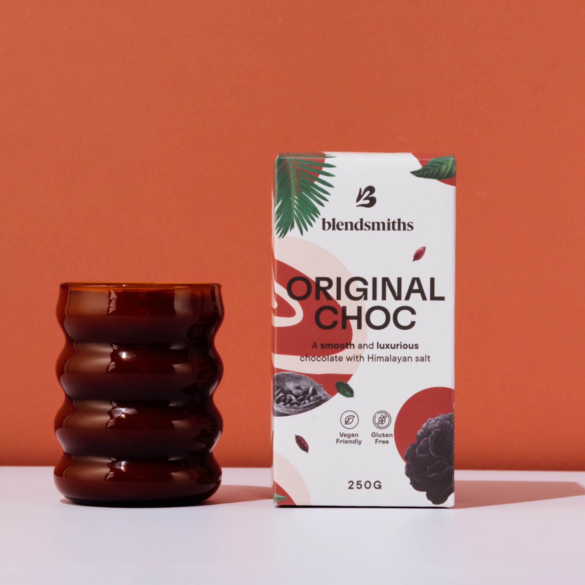
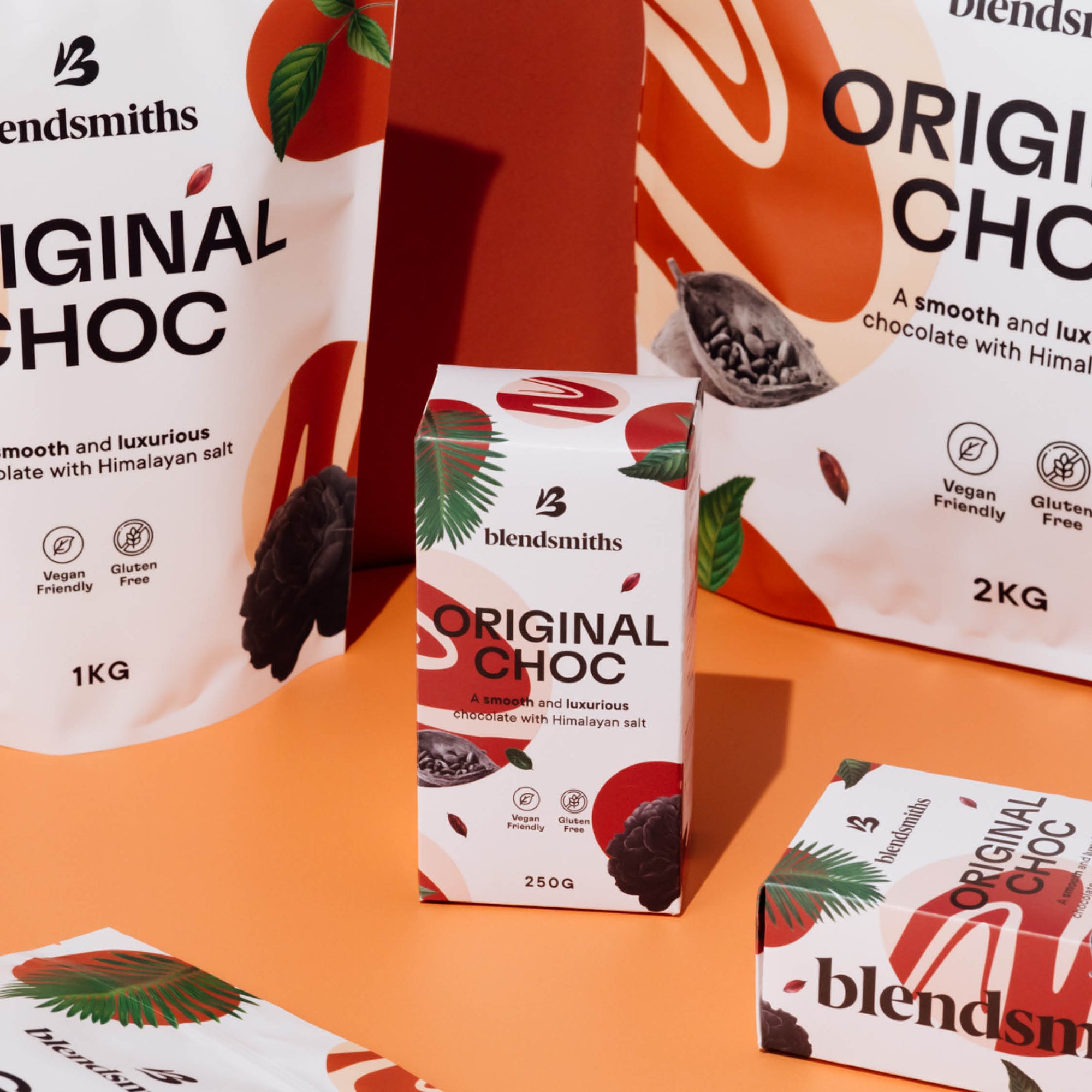
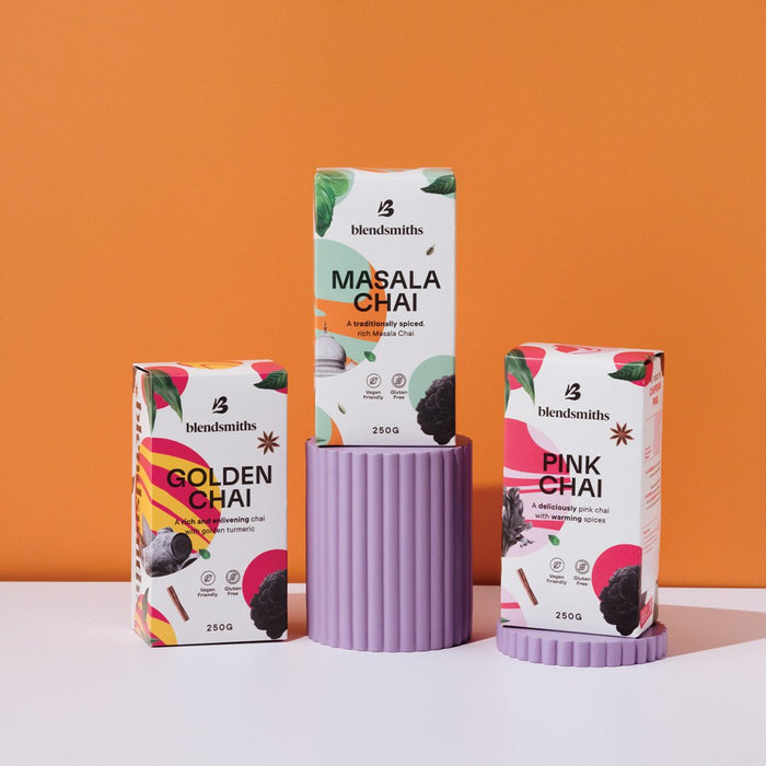
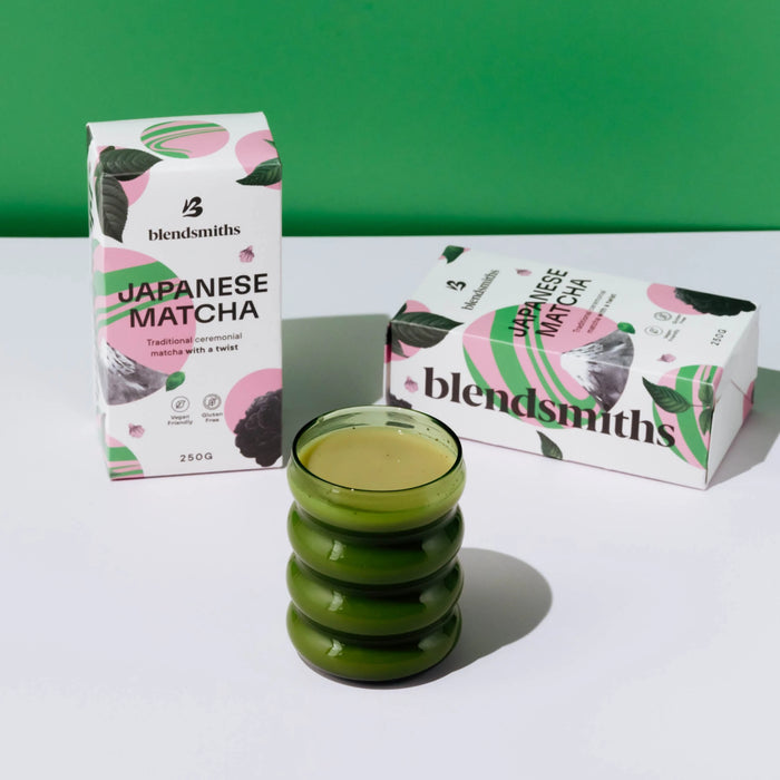
At trade shows and events, our colourful branding is usually the first thing people mention. Before they know who we are or what we do, they're drawn in by the shades and memorable packaging. They come over out of curiosity and stay for the taste.
We’ll happily take that.
Why Colour Matters
Colours make us feel things.
Think about the brands you remember most. Chances are, you can picture their colours before anything else.
In busy spaces, we're naturally drawn to things that feel different. Colour has a way of cutting through the noise and sticking with us.
It catches our attention, sparks curiosity and makes experiences feel a little more memorable. We might not remember every small detail, but we often remember how something made us feel.
Bold brand identity does give people something to connect with.
Standing out isn't about being louder at all. It's simply about being recognisably you.
Bringing a Little Joy Back
For us, colour has never been about being different for the sake of it. It's simply who we are. Flavour-forward, confident and full of personality.
We make drinks that brighten someone's day, so it’s only right the rest of the brand does too.
In a world that's become increasingly beige, we've decided to stay colourful.
A splash of colour won't be everyone's cup of tea, and that's okay. But if a bright pink wall or colourful pack is enough to make someone stop, smile and discover something new, then we’d say that’s a pretty good place to start.
FAQs
Why does Blendsmiths use bold colours in its branding?
Blendsmiths uses bold, colourful branding to reflect what’s inside the pack. Our blends are full of flavour, personality and character, and we wanted that feeling to translate visually too. From our packaging to our stands, colour helps us create a brand that feels as vibrant and distinctive as the drinks we make.
What is the importance of colour in branding?
Colour helps brands communicate personality, create recognition and attract attention. A distinctive colour palette can also make a brand more memorable, particularly in busy or competitive spaces.
How does colour affect consumer behaviour?
Colour can influence attention, perception and emotional response. While reactions vary between people and cultures, distinctive and consistent use of colour can help a brand stand out and create a more memorable experience.
```